Bungie

Overview
Bungie is a world-class AAA company, most notably known for creating the games Destiny and Halo.
Role
UX Design Intern
Timeline
June 2021 - August 2021 (10 weeks)
Summary
While at Bungie, I had the fortunate opportunity to work with many talented individuals on such a large game, Destiny 2. Within Destiny 2, I was a UX Design Intern integrated into the Commerce team, where I focused on UX improvements on the Eververse, the main storefront.
At the beginning of the internship, I was introduced to a few different projects to explore, with the intention of focusing in on one of them.
The projects were:

I ended up focusing in on Bundles, where I explored how players experience shopping.
I conducted competitive analysis on storefront UX, explored a variety of solutions, and wireframed user flows to share with the team.
The Eververse
The Eververse is the main storefront for Destiny 2. Cosmetic items of all kinds can be purchased here, including Emotes, Skins, and Finisher animations.


Bundles
Bundles in Destiny 2 are groups of cosmetic items that can be purchased together, and multiple different kinds of Bundles can be purchased in the Eververse.
Bundles can drastically change the look of your character. Players love being able to flex their flashy outfits to other players. In fact, players love outfits so much that they dedicated a subreddit to it: r/DestinyFashion
r/DestinyFashion Miles Morales post:
The Problem
Players experience friction when shopping for Bundles.
How do we know players experience friction?
Prior to exploration, I conducted an audit on many competitor and popular online video games. One thing I found that is shared in all of the games is seamless preview of cosmetic items. Video games like Dota 2 and Fortnite allow players to preview their items with ease, commonly using a character model that updates real-time based on the cosmetics selected.
In Destiny 2, it takes many clicks for a player to view and purchase a Bundle.
To successfully preview and purchase a Bundle, it takes a player around 13 clicks. This is far too many clicks to preview a bundle of 5 items. Once in the Bundle preview page, players have to enter a different preview page to view an individual item, and they have to exit the individual preview page and re-enter it to view the next item.
This makes previewing Bundles very tedious.
Initial User Flow
Below is the initial user flow for previewing and purchasing a Bundle that we explored solutions for. The user encounters heavy friction when wanting to preview multiple individual items because the individual item preview page exists separately from the Bundle preview page (meaning the user has to enter and exit between these pages multiple times)
1. Player enters the Eververse
2. Player hovers over Bundle
Player right clicks to preview Bundle
3. Player enters Bundle Preview Screen
4. Player hovers over individual item
Player right clicks to preview individual item
5. Player enters Individual Item Preview Screen
6. Player exits to Bundle Preview Screen
7. Player right clicks to preview another item
8. Player exits to Bundle Preview Screen
9. Once player has previewed enough items, player exits to Eververse
Player hovers and left clicks to purchase Bundle
Exploring Solutions
1A. Pagination (REJECTED)
I decided not to pursue this solution because it doesn’t address the core of the problem. It feels like a Bandaid Solution. Players still have to enter a new screen with this method (creating friction), although they have an easier time previewing individual items once they enter.
Further, implementing pagination in this screen would have ramifications on design patterns elsewhere. Areas of the UI such as the inventory screen and others could benefit from pagination. This means that this solution would either result in inconsistency or expanding scope.

1B. Right click preview (APPROVED)
Instead of entering a new screen to preview an item, the character model on the right changes to reflect the individual item the player is previewing.
A green marker is placed on the item that is currently being previewed (This green marker can be seen elsewhere in Destiny UI). When a player wants to preview another item, they can simply right click another item and the character model will change again.
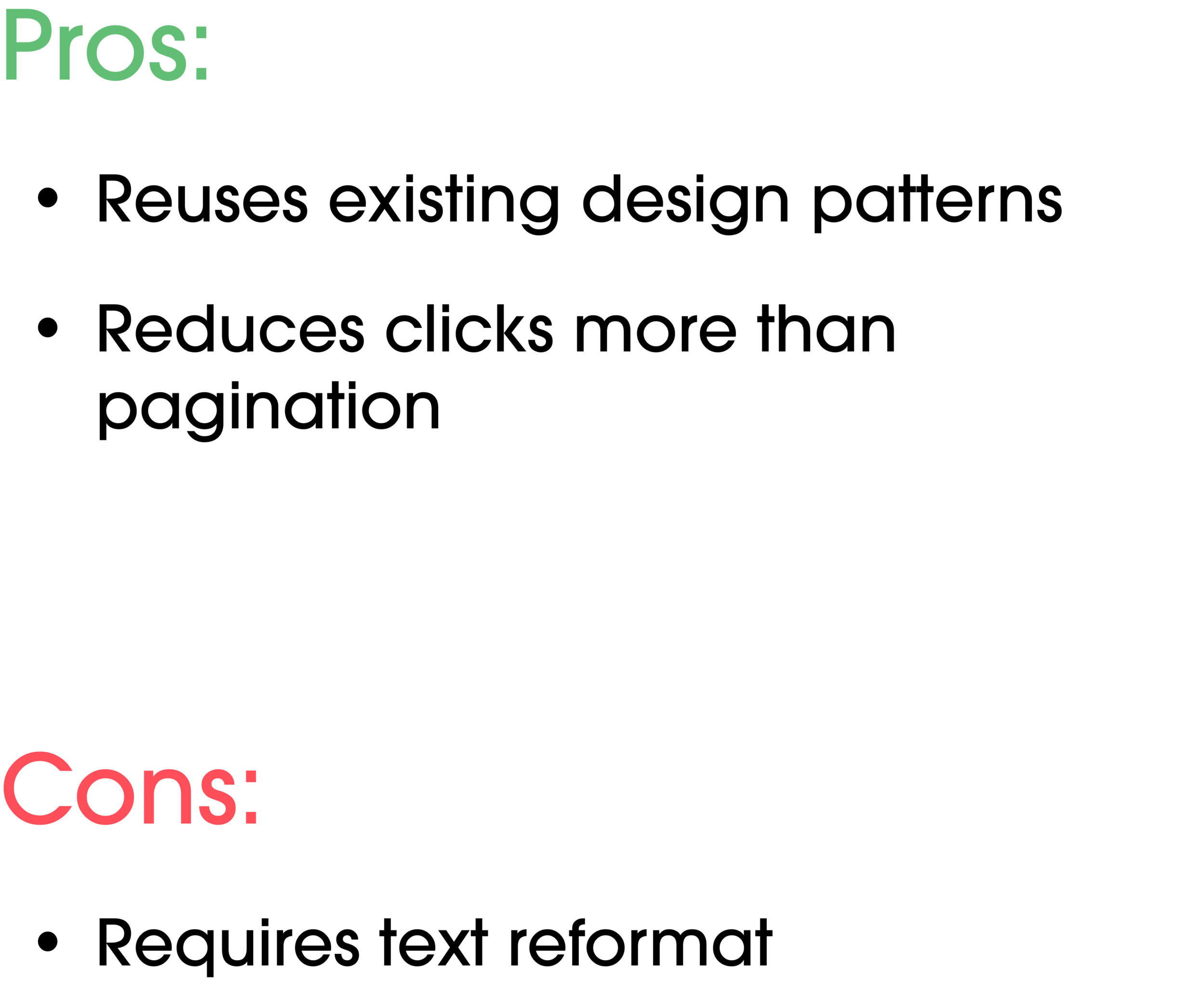
I decided to pursue this option because it reuses an existing design pattern that’s familiar to players (In the Transmog screen). Further, it reduces clicks more than the previous design, while players stay on the same page to preview.
Some of the cons of this design include less space around the character model and extra consideration for how text is formatted.
2. Purchase Button (APPROVED)
Initially, when players were ready to purchase a Bundle, they had to exit the Bundle preview page and purchase the Bundle in the main store menu.
With this, players can simply purchase the Bundle on the Bundle preview page, without having to exit.
The hover tooltip in this design is identical to the hover tooltip that players would see when purchasing the Bundle in the main store menu.
Players would need a small adjustment to this design, as with any change.

Improved User Flow
Combining solutions 1B and 1C, I arrived at this user flow.
1. Player enters the Eververse
2. Player hovers over Bundle
Player right clicks to preview Bundle
3. Player enters Bundle Preview screen
4. Player hovers over item in Bundle
7. Once player has previewed enough items, player hovers over purchase button
5. Player right clicks to preview item
6. Player right clicks to preview another item
Big Challenges
Player Sentiment
Destiny 2 has a very large and vocal player base. The game also shifted from a paid-model to a free-to-play model in 2019. This means that a sizeable portion of the player base, who purchased the game, is anti-monetization. As a UX designer on the Commerce team, I had to be a strong player-advocate when designing solutions, ensuring that the player sentiment would be positive to a change. I also had to balance this with company and business needs, which often conflicted with player needs.
For example, when exploring the implementation of new kinds of Bundles in the Eververse, I had to think deeply about how players would react to some of these changes.
The idea was that (as a new stream of revenue) there could be bundles that are locked until a player has reached a certain milestone. Similar to Bungie Rewards, where players have an opportunity to buy a physical item from the Bungie shop after completing an in-game objective, players have the option to purchase a bundle for silver after reaching a certain Vendor level or Power level. It adds a level of interactability into the shop, while incentivizing players to purchase certain bundles.
Features like this aren’t completely absent in Destiny 2. For example, Exotic Weapon Ornaments (Skins for specific weapons), which can only be equipped once a player unlocks that specific Exotic Weapon in game, are purchasable in the Eververse.
In attempt to ease player sentiment, I decided to add rewards for free players as well at the end of the Power Level Bundle progress bar. Simple additions such as alternative free routes can shift player sentiment positively.
Despite all of this, this exploration is still tentative because player sentiment can fluctuate heavily depending on implementation.
Engineering Constraints
In this screenshot of the Eververse, I noticed there were duplicate bundles (Red and Blue brackets). The only difference between them being the currency they can be purchased with.
My immediate instinct was to propose we merge these duplicate bundles and add a menu that allows players to select the currency they wish to purchase the bundle with.
However, this was immediately labeled as unsolvable because of the way the currency system was originally built. Much of Destiny 2 was built on antiquated framework that doesn’t allow for flexible UI options.
Because of this, it’s especially important at Bungie to work with engineers early to talk about technical feasibility of your designs. Learning to create designs that were consistent with the UI options available took some adjustment.
Learning to work in a highly autonomous environment
At the start of my internship, the amount of freedom I was given was a little intimidating. A big challenge was learning to reach out to my co-workers to plan chats/pick their brains.
At Bungie, knowledge is very siloed due to the very deep lore and history of Destiny. Senior workers at Bungie have all kinds of knowledge, ranging from why/how certain staple features were implemented all the way to the most obscure facts about Destiny lore.
For example, I ended up reaching out to a Senior Designer at Bungie who created the UX for the Eververse, the storefront I spent most of my time working on. She was able to give me deep insight into the creation of the Eververse, like why certain features exist or what she thinks could be changed now.
Conclusion

Originally, the user flow to preview and purchase a bundle took 13 clicks. With the improved flow, this takes players only 7 clicks, nearly half as many clicks.
Working on Destiny 2, a continuous game that pushes new content in the form of big expansions, means that the production cycle is very slow. Features are commonly planned out 1-2 years in advance.
My internship was 10 weeks in this 1-2 year cycle, so unfortunately, I wasn’t able to see how my features and explorations were going to be implemented. At the end of my internship, I presented my findings to the team, and my UX design mentor continued to pursue my designs. Despite this, I feel as though my improved user flow is most likely to ship, among other explorations conducted during the internship.
If I had more time, I would’ve liked to explore more into Shaders, one of my side focuses. Shaders present an interesting problem nested in the constraints of the item itself, and the solution would have to work around the limitations of the item.