Internship @ Epic Games

Overview
Epic Games is an industry-leading software company, known for producing Fortnite and Unreal Engine.
Role
UX Design Intern
Timeline
Jun 2022 - Dec 2022 (6 months)
⭐ Solution Prototype
Introduction
From June 13th to December 16th, 2022, I worked at Epic Games as a UX Design Intern on the Fortnite Player Journey/Social team.
The Player Journey/Social team works on features that connect players from one gamemode to the next. This includes features such as chat, discovery, reporting, and parental controls.
I worked under the supervision of my lead, Harold Emsheimer, and interacted and collaborated with many other talented indviduals on the team.
Project Overview
My first project was to improve the in-game reporting system in Fortnite.
Toxicity is a rampant problem in nearly every multiplayer video game. While it may be difficult to stop toxicity entirely, we can discourage toxic behavior by enforcing community rules, and the first step is to provide players with the tools to quickly/efficiently report toxic behavior.
The general goals of this project were:
1. To improve the overall reporting experience
2. To enable players to quickly/efficiently send reports
This project was part of a more extensive effort to ensure a healthy ecosystem, eliminate toxic behavior, and improve the efficiency of reporting activities.
Current State of Player Reporting
1. Initiating a report
4. Selecting a player to report
2. Selecting a report type
5. Confirmation screen
3. Selecting a reason for report
6. Thank you screen
The Problem
Players experience friction when reporting other players.
How do players experience friction when reporting?
Let’s take a closer look at this reporting flow.
Selecting a reason for report

Selecting a player to report
One of the first things I noticed is the ordering of the reporting steps.
The report reason is selected before selecting the player being reported. This is odd for a couple of reasons.
1. It’s unnatural for players
In most multiplayer games, report entry points are typically accessed through end of match screens, scoreboards, or some other manner of entry point where the player selects the offender first before the report reason. Scoreboards aren’t implemented into Fortnite due to the high number of players in each game.
Ex. At the end of a game, I see the player I want to report on the scoreboard, I select report, then I select the reason for the report.
2. It causes more friction for players
Let’s say I want to report 2 players. 1 was harassing me last game and 1 was cheating.
With the current flow, I would have to decide which person out of the two I want to report first and for what reason I’m reporting them for. I must decide this first before proceeding with the reporting flow. If I don’t remember the names of the abusive players, I’d likely either have scroll through the list of reportable players to jog my memory (skipping the first reporting step in the process) or intentionally scroll past an abusive player to find the one that matches my report reason.
This takes much more mental gymnastics as opposed to scrolling the player list first, organically finding/recognizing one of the players I want to report, and then selecting the reason for the report.
So in general, selecting the player first in the reporting flow is a much more familiar design pattern to players and makes the reporting process easier for them down the line as well. Although this was met with some resistance, this is a design stance that I didn’t budge on, as I believed strongly in its importance.
Let’s take a closer look at some of the individual screens in the player reporting flow.
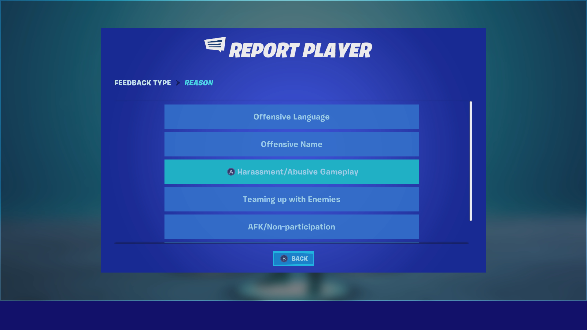
Reason Select Screen
Upon entering the reporting flow, the reporter selects a reason for their report.
Pain points:
Poor use of screen real estate
There are only 7 report reasons, yet the reporter has to scroll down to view all of them.
Player Select Screen
After selecting a reason, the player must navigate this ambigious list of player names to find their offender.
Pain points:
Hard to navigate
Not enough context
Poor use of screen real estate / Low information density
Navigating this list of names is challenging because there isn’t enough context to identify players.
Reporters often don’t have the player’s name at hand, and Fortnite lacks a match history space to look them up. Because of this, it would be helpful to have other identifying information beyond the username, like the match this user played in, the date of the match, and even what skin they were wearing.
Because Fortnite doesn’t have a natural match history space, we must pay extra attention here to make sure players are given all of the info they need to identify their offender.
Additionally, only 5 players can be seen at a time on this list, making the task of finding one’s offender even more difficult.
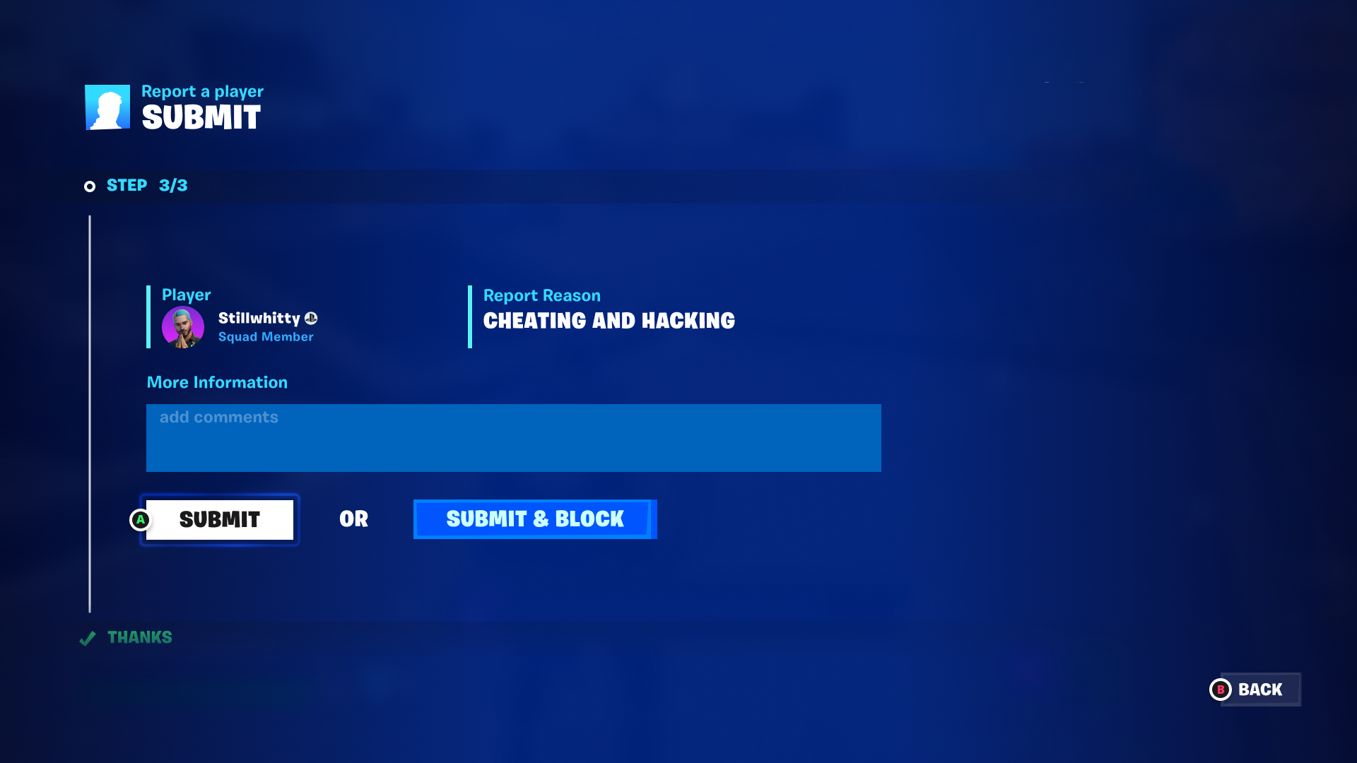
Submit Screen
The final step of the reporting process is the submit screen, where players get a summary of their report.
On Console
Pain points:
Text heavy, especially on console
Community rules is unselectable on console
Block option is selected by default
On PC
Looking at the submit screen, especially on console, the information presented is a little hard to scan because it’s so text heavy. There aren’t many visual elements in place to help players parse the information.
The “community rules”, when viewed on console, is just a single URL link that cannot be selected.
Lastly, the block option is automatically selected by default. This isn’t necessarily a bad thing, but players can potentially look past this feature and block players unknowingly.
User Stories
After taking a look at the current state of the reporting flow, I decided to draft some user stories and MVP features to get a better idea of what problems I’m solving and what features I should be prioritizing.
Ideation and Wireframing
Given our initial analysis of the reporting flow, we can hypothesize some general problems
The reporting modal is very dense and the process feels intimidating
Player list is too hard to navigate, players have difficulty finding the player they want to report
Submit screen is hard to parse, players have difficulty reviewing the report information
Hypothesis 1: Process Transparency
To better situate players in the modal I proposed this solution
Adjust the modal stepper to more precisely show the player where they are
Before
After
Hypothesis 2: Player list navigability
To help users navigate the player list I proposed the following solutions
Add avatars
Organize players by match
Reduce player cell size
Player Avatar Pushback
A simple add that I felt would help make this list feel more approachable and scannable was the inclusion of player avatars. Perhaps adding player avatars into the report list could help the reporter understand what they’re looking at and identify their offender faster.
Great! So the idea was to include the avatar of every player on the list, but after talking to peers it seemed like there would be a problem. There wasn’t necessarily an engineering restraint, but there were protection efforts in place that prevented us from pulling avatar data from all players.
In the past, when Fortnite included the avatars of all players in the sidebar (including searched players), there was an incident where people were estimating Fortnite’s skin revenue by counting players with the skin equipped right after a skin release.
We came to the conclusion that while we wouldn’t be able to show the avatars of every player on the list, we could still include the avatars of players who were directly interacted with in game and friends. Even if we don’t have the avatar for a player and we can only show the default avatar icon, it’ll still help convey to players that they’re looking at a list of players and not just text.
Hypothesis 3: Submit screen clarity
To help users better parse the submit screen and understand their actions I proposed the following solutions
Include avatar
Cleanly organize report information
Make the blocking option more prominent
Navigation
When it came to the Submit Screen, there was debate on how players would navigate this screen on console. Depending on which path we took, the way players interact with the block option also changes.
Should players be able to natural navigate around the page with the left stick? Should the page have dedicated keybinds for each element on the page instead, like how it currently is in game? Perhaps a mix of both?
Dedicated keybinds allow for faster reports if the player is familiar with the keybinds. However, all the keybinds can be overwhelming for players who are less familiar with the reporting flow.
Natural navigation is more intuitive, but it can be a little slower, especially when navigating only vertically.
I created small graphics to share and discuss this topic with my peers.


After getting opinions on these options at my design sync, I was able to narrow down onto a couple options.
Almost all of us agreed that dedicated keybinds are messy and that natural navigation or hybrid are better options.
UX designers from the DevOps team, the group of people that build up Fortnite’s design library and patterns, felt strongly about moving towards the direction of natural navigation in Fortnite as a whole.
At this point in time, we landed on this hybrid version of the submit screen that incorporates both natural navigation and a dedicated keybind for the block button.
Visual Design
After the UX of the reporting flows was nearly set, the project moved to another stage of pre-production: Visual Design. At Epic Games, UX designers work closely with visual designers to ensure that the work can transition from wireframes to beautiful visuals without detracting from the usability of the design.
Oftentimes, visual designers will make changes to the layout of certain screens, which may impact the UX that had been previously solidified. It’s the UX designers job to be flexible, but hold the line on core UX experiences.
One requirement that developed over the course of the visual design handoff was that different report reasons could result in different elements appearing in the submit step. An example being that if players select “Cheating and Hacking” as a report reason, a text field would appear in the submit screen. Or if players selected “Offensive Voice Chat”, then different suggestions/text would appear in the submit screen. This meant that the final design needed to be dynamic, and any explorations that attempted to combine all of the reporting steps in one screen would be not ideal.
Furthermore, having multiple steps allows the reporting design to accommodate Island Reporting and any other reporting flows we might add in the future.
Initial Explorations
Here are some of the initial visual design explorations for player reporting.
100% Off-Mock
Original Module Size
Combined-Step Exploration
Full-Width Module
Pros:
Reporting flow is one step
Player Select takes up less screen real estate
Cons:
Block feature is confusing
Busy
My main concern with this design was regarding the block feature. The block feature was originally intended to give the player an option to block the offender they’re reporting at the end of the report. However, this design makes the block feature appear as if the player is able to block any potential offender on the list.
Also, as mentioned earlier, there grew a need for the reporting flow to be dynamic during the visual design process, which unfortunately ruled out many of these “combined-step” explorations. Although these type of designs are seemingly convenient, we had to choose a design that is more flexible and applicable to other reporting sectors.
Condensed Player List
Seeing how small some of these explorations made the player select, I pushed visual design to increase the information density in the player list.
Fortnite is a game that operates with large player counts, with the average user encountering upwards of 100 players with each session.
Because of this, it was important to design a player browsing experience that enabled users to quickly and easily scroll through a long list of players. This more compact player card increased above-fold card visibility from five to nine cards and reduced the scroll height of the player list by 40%.
Vertical Scrolling
After a couple rounds of visual passes, we explored this option.
Pros:
Layout is clean and satisfying to complete
Clear visual hierarchy
Cons:
Potentially harder to build
Step counter gives less info
This was a super interesting exploration where the reporting flow progressed vertically. Once the first step is completed, the reporting flow would shift upwards so the next step underneath is revealed. While this flow felt like a single page, only one step was displayed at a time, so the experience was still dynamic.
Another benefit of this flow was that the step counter didn’t compete visually with the CTA like it did in previous explorations. The only tradeoff was that the counter conveyed less information to users.
Of all our explorations, we felt like this solution best balanced technical feasibility, ease of use, and the need for our flow to be dynamic.
The next step was to implement the vertical scrolling design to our various reporting steps.
New Player Select
As expected, the Player Report List fit nicely into the vertical scrolling design.
Header Open
Header Closed
New Reason Select
Throughout the visual design handoff, the reason select screen remained relatively untouched except for a couple key changes.
We made the report reasons much more information dense, with three report reasons per row.
Also, because the reporting flow is split into multiple steps, we realized players might need a reminder on who they’re reporting midway through the flow.
We addressed this potential pain point by implementing a new UI element that shows the offender that the player is in the process of reporting on the top right hand corner of this page.
New Submit Screen
After rearranging the submit screen many times, this is where we landed towards the end of visual design.
The screen contains all of the same elements it did before, but it’s been organized in way that’s cleaner and makes better use of screen real estate.
User Research
After settling on the visual design of the player reporting flow and wrapping up the core UX, we contacted User Research to get our designs in front of testers.
Once the researcher and I aligned on goals and plans, I worked to create a prototype that the testers would interact with for the research.
Logistics
We recruited 8 participants that have played Fortnite in the last 12 months through UserTesting.com to participate in a moderated study where they were asked to answer questions and provide feedback on a prototype examining the player reporting flow in Fortnite.
The main goals for the research were finding out if:
If players understood the overall reporting flows and had no trouble navigating them
If players understood the interactive elements in the player select screen
If players understood how to block the offender they’re reporting
Results
After about a week or so, I was able to receive a report on the User Research conducted on the new Player Reporting flow. Here are some of the main takeaways from the research.
Positives
The steps for the player reporting process were clear and well-defined
The collapsible header menus and other interactive elements were discoverable
Negatives
Player block option was not discoverable for some testers and was not enabled by default
Overall, the UXR process went very well. Testers didn’t have any issues with the core Player Reporting experience, but they did run into some problems regarding the block option in the Submit Screen.
Iterating the block option
Because players struggled to locate the block button during user testing, I made some revisions to the designs. I considered two possibilities to increase visibility.
1. Make the block option checked by default
This is how the block feature currently functions in the game. If a player overlooks the block option while sending a report, at least their offender will be blocked and no longer any threat to the player.
2. Make the block option more prominent
While defaulting players to block their offenders is a safer option for the player’s protection, players are still going to be sending reports without knowing the full extent of what they’re doing. We want players to be intentional in their actions, especially when it involves blocking another player.
Making the block option more prominent would ensure that players are weighing this choice.
When sharing these options at my UX sync, there were some concerns with selecting “block” by default because we can’t assume that all users writing reports also want to block those users. I decided to add a new button “Submit and Block” to increase the transparency of blocking while mitigating the risk of accidental blocks.
Final Designs
With this, pre-production was completely wrapped up! Unfortunately, production was set to happen in early 2023, so I wasn’t able to see this project fully through.
However, I did as much as I could to prepare for production. I created a Production Spec detailing all of the different screens I worked on within Reporting. This includes player reporting, which this case study covers, as well as island reporting, voice reporting, and a debugging form.
I included annotations on key screens to ensure that engineers are able to understand how different screens/elements function. I also cleaned up the extensive reporting prototype to give engineers a great feel for the flows.
Aside from the production spec, I created a Documentation page where I listed out many of the gritty details in reporting such as all of the different states for the submit screen, report reasons, and player select headers.
Here are the final designs for the Player Reporting flow.
Learnings and Takeaways
Working with Visual Designers
Working with visual designers can be tricky. UI and UX are so closely tied that making changes to the UI can oftentimes disrupt the UX of the screens. I’ve learned that the UX handoff to visual design can be made much easier through constant feedback sessions and clear communication.
Working with visual design earlier helps avoid any potential roadblocks down the path. Debriefing the visual designer on the project and walking them through the core UX experiences can help familiarize them with the work.
I’ve learned when giving feedback, it’s important to clearly state why I like and dislike various aspects of the design to help them iterate more efficiently. It’s good to be flexible, as it can potentially lead to something great, but it’s very important to draw the line if the UX is being compromised.
Ownership over a Project
At Epic Games, work moves very fast. Because of this, I was able to experience all of the stages of pre-production. I had a lot of ownership as the sole UX designer on the reporting project. Although I sought out feedback from my peers in UX dailies or my lead, I had the final call on UX decisions. I found this to be a learning experience, as it led me to gather and synthesize feedback to factor into decisions.
Having ownership meant that seeing the project’s success in UXR felt extra good. It’s a double-edged sword though, as mistakes made during the project fell on my shoulders.
Working with UXR
I had the fortunate opportunity to work with UXR to get my designs tested by Fortnite users. UXR used UserTesting.com to recruit testers that had played Fortnite recently and had an Xbox controller for the prototype.
I was able to schedule a 1:1 with a UX researcher to brief them on the project and talk them through my goals for the research. I then prepared a prototype for the testers to use and created a research plan/document.
Through this, I was able to get feedback and validation for my designs. I then used this new data to make any necessary iterations to my designs.
Being able to get my designs in the hands of real Fortnite players was an extremely valuable experience. Iteration through feedback is an essential part of the design process, so being able to experience that in a large-scale company setting was amazing.
Ensuring Smooth Handoff with Engineers
As I learned from my previous internship as well, work with your engineers early! While you may not handoff your work until the UX and pre-production stages are solidified, it’s a very good idea to work with your engineers early to make sure your designs are buildable. For example, when I came across a promising visual design exploration that was very different than our current design, I reached out to tech designers and engineers to check if it would be doable to build. This way, when the project moves to production, everyone will be mostly on the same page.
Other than that, I also made sure I created a Production Spec detailing all of the different screens within Reporting. I included annotations on some of the features/elements that needed additional information. I also created a Documentation page where I listed out every detail/state imaginable for all of the Reporting flows and screens.
Conclusion
Overall, my time at Epic Games proved to be an extremely valuable experience. I got to collaborate with and learn from many great minds across different teams.
Working on reporting was very fulfilling, as I felt like I was designing systems that were truly going to benefit players, and I’m proud of the work I accomplished.
I’d like to give one last thanks to my lead, Harold Emsheimer, for the mentorship and support he provided me along the way.
Now that my time at Epic is over, I’m looking forward to wherever my career takes me next!
