Maté

Final Design Demo
Overview
Maté is an app concept meant to improve the remote learning experience during quarantine. This was ideated and wireframed for UCSB Design Club’s Spring 2020 Challenge.
Skills
User Interface Design
User Experience Design
Collaborations
The ideation process was done in a collaborative setting with two other team members, Ian Pancho and Ruchika Saswade. However, afterwards, I carried the project beyond the scope of the initial challenge, redesigning the entire UI.
Context
The UCSB Design Club hosted its first design challenge in late May 2020. All of my original randomly-selected group members dropped out, resulting in my new group being formed half way into the challenge. Despite this, we worked hard to finish our project under pressure.
Even though we had a finished design, I still felt dissatisfied that we didn’t have more time. This led me to look back and redesign our entry after the challenge had ended.
Timeline
May 2020 (Initial Challenge)
June 2020 - August 2020 (Redesign)
Tools
Figma
The Prompt
The switch to remote instruction as a result of COVID-19 has greatly impacted student learning. Design a solution that improves the remote learning experience for students and professors. Consider the needs of students, including how students can better communicate with professors and TAs.
Research
We sent out a Google survey to our friends and peers and found some interesting data from 35 responses.


Students that are remote learning find juggling multiple platforms a jarring experience.
Mental Health
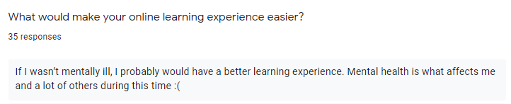
A huge elephant in the room on campuses today is the mental health of students. Many of our survey responses mentioned that their mental health has been suffering as a result of quarantine and online learning. A combination of increased workload, less peer interaction, and toxic family situations has led many students feeling not their usual self.
So factoring in all of this research, we really wanted to create an app that not only empowered students to manage their academic lives clearly and cohesivly but also encouraged them to think more intentionally about their mental health. We also wanted to optionally loop teachers into the equation, giving them insight into the emotional states of the their students, so they can be more present and mindful about creating a classroom culture that is an emotionally safe environment
Sketches
During Challenge
With our research, we decided to design a product that combined many of the features from other common school platforms. This way, we can create an all-in-one kind of product, alleviating the stress of having to use multiple services.
In our sketches, we included a navigation bar page for Grades, Calendar, Chats, Self-care, and Lectures.
We decided to use a mobile platform for our idea, as we felt students who are on their phones frequently would get the most convenience out of it. A desktop version is very realistic too. However, given our limited time constraint for the challenge, we explored what a mobile app would look like.
Low-Fidelity Designs
During Challenge
After several rushed hours we produced this. Although we put in hard work, I was still dissatisfied with this design. Where to start?
Accessibility Issues
We definitely went overboard with the colors—so much so that the app didn’t pass accessibility standards and acceptable color contrast ratios.
Barebone Home
The home page consisted of big buttons. It didn’t provide any additional information to users. The class page shared the same issues.
Tight Calendar
The calendar page was designed poorly in that there isn’t much space to view upcoming events. It also didn’t support alternative viewing methods.
Lacking Self-Care
Even though we were excited about our Self-Care idea, the page was pretty single-featured. I wanted to expand upon this idea a little more.
Wireframes
Post-Challenge
I wanted the home page to be much more functional than it was in the previous iterations, where it only consisted of big buttons for each course. In these wireframes, you can see the home page acts more like a dashboard for relevant information.
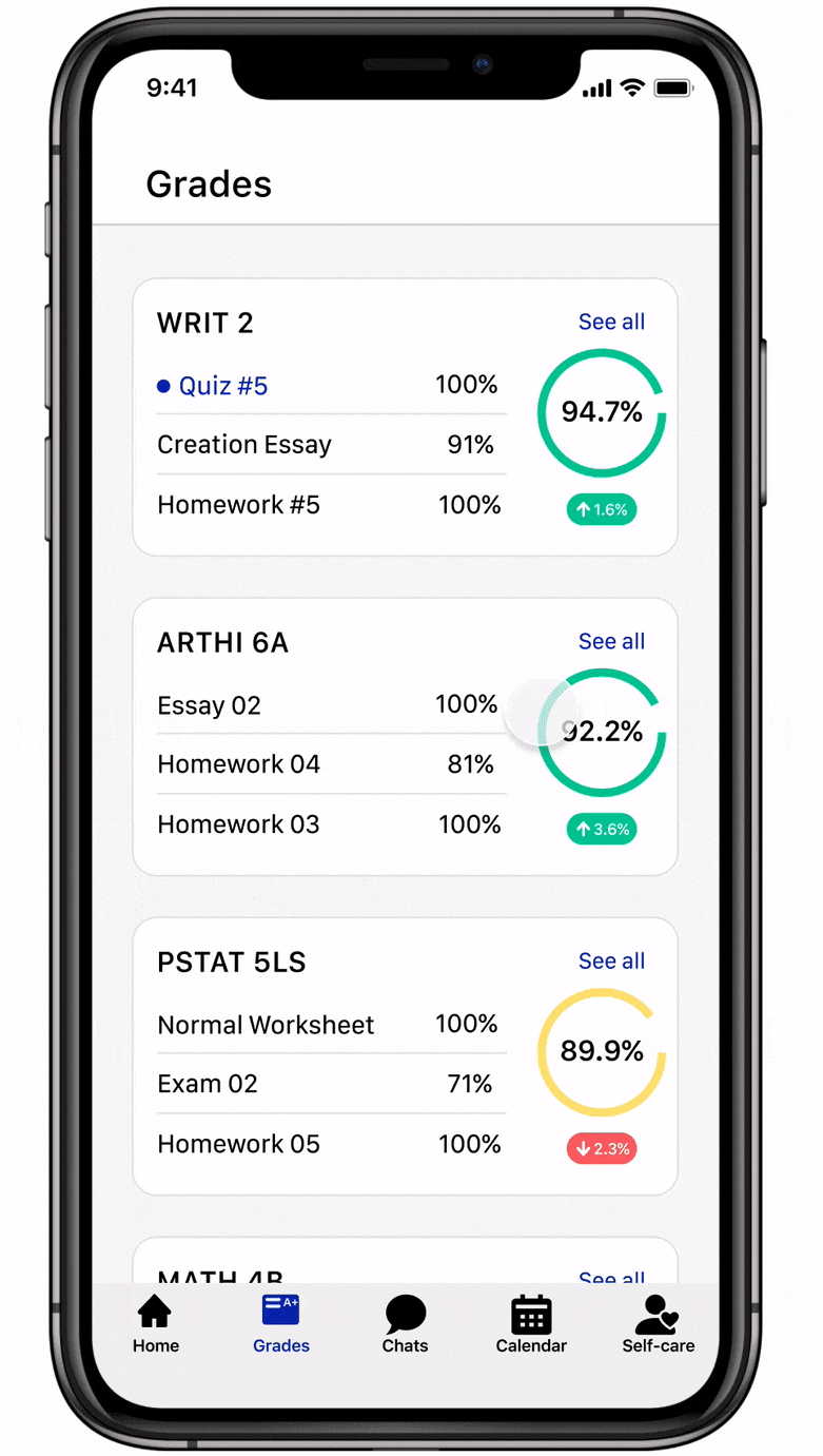
The grades page is also more functional in this iteration. Instead of showing only your courses and grades, it also displays a preview of your 2 to 3 most recent inputted grades under each course.
For the calendar page, I was prototyping different ways to display the calendar viewing options. In the end, I opted to go for the design where the dates are in the header, as it makes the scrolling behavior more clear; I definitely wanted the dates to stay fixed while scrolling.
Iterations

Header
Screen real estate is important, especially on mobile devices. In the previous iterations, more screen real estate was taken up in the header to display the school name and current quarter, with a dropdown menu to change quarters.
Time was spent here considering the usefulness of displaying the user’s school name and having a dropdown menu for quarter/semester in the header. Most users aren’t going to be attending two schools at a time, making the number of use cases for displaying the school name in the header quite small; the same goes for changing quarters in the header.
Factoring this in, I opted to remove both the school name and quarter/semester dropdown from the header, saving screen real estate and removing clutter. The option to change quarters will stay, but it’ll be moved to a settings page instead.
Upcoming Assignments
When initially wireframing this section, I thought it would be pretty pain-free to make. Only when I increased the fidelity, I realized I couldn’t just display the upcoming assignments in single lines.
The theme of this set of iterations is information hierarchy. When glancing over the second iteration, it’s not immediately clear what you’re reading. Information that is most important should be read first and have prominence over other information displayed. By the end, the section was much more scannable.


Class Buttons
Again, screen real estate was a major factor in redesigning these buttons. These were shrunk down in size to allow room for more content in the home page. Grade percentages were added, followed by grade trends in a latest iteration.
The names of professors were removed to accommodate these changes. However, through interviews with peers, most didn’t mind this loss, given that the professor names are displayed in the class pages anyway,
Final Designs
Post-Challenge

Home and Course Page
Your three closest upcoming assignments are displayed on the dashboard.
The courses are now in cards and have grade trend indicators on them. These indicators show your grade changes in the last week; this would be explained in the onboarding phase.
Mood graph shows your mood changes from the data in the Self-Care page.
Grades
View your grades, recently graded assignments, and grade trends here.
You can also create mock grades and grade changes to plan ahead.

Chats
Simple chats page to facilitate more interaction between peers and between students and professors.
Group chats for each class are created upon sign up.
Calendar
The calendar lets you keep track of school assignments, deadlines, and outside events without having to use a separate calendar app.
Tap on an event to view the assignment description from the course page.

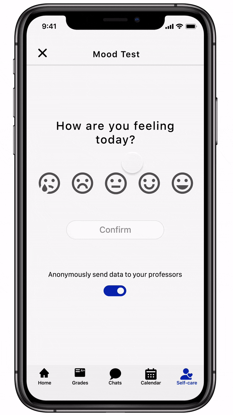
Self-Care
Self-Care gives you a space to express your feelings from day to day.
You’re asked “How are you feeling today?”, and your moods are tracked on a graph.
You can choose to anonymously send your data to your professors, those who opt in of course.
In the Self-Care page, "Friendly Reminders” are generated based off your mood trends.
You can message your professors, who have opted in, at the bottom of the page.