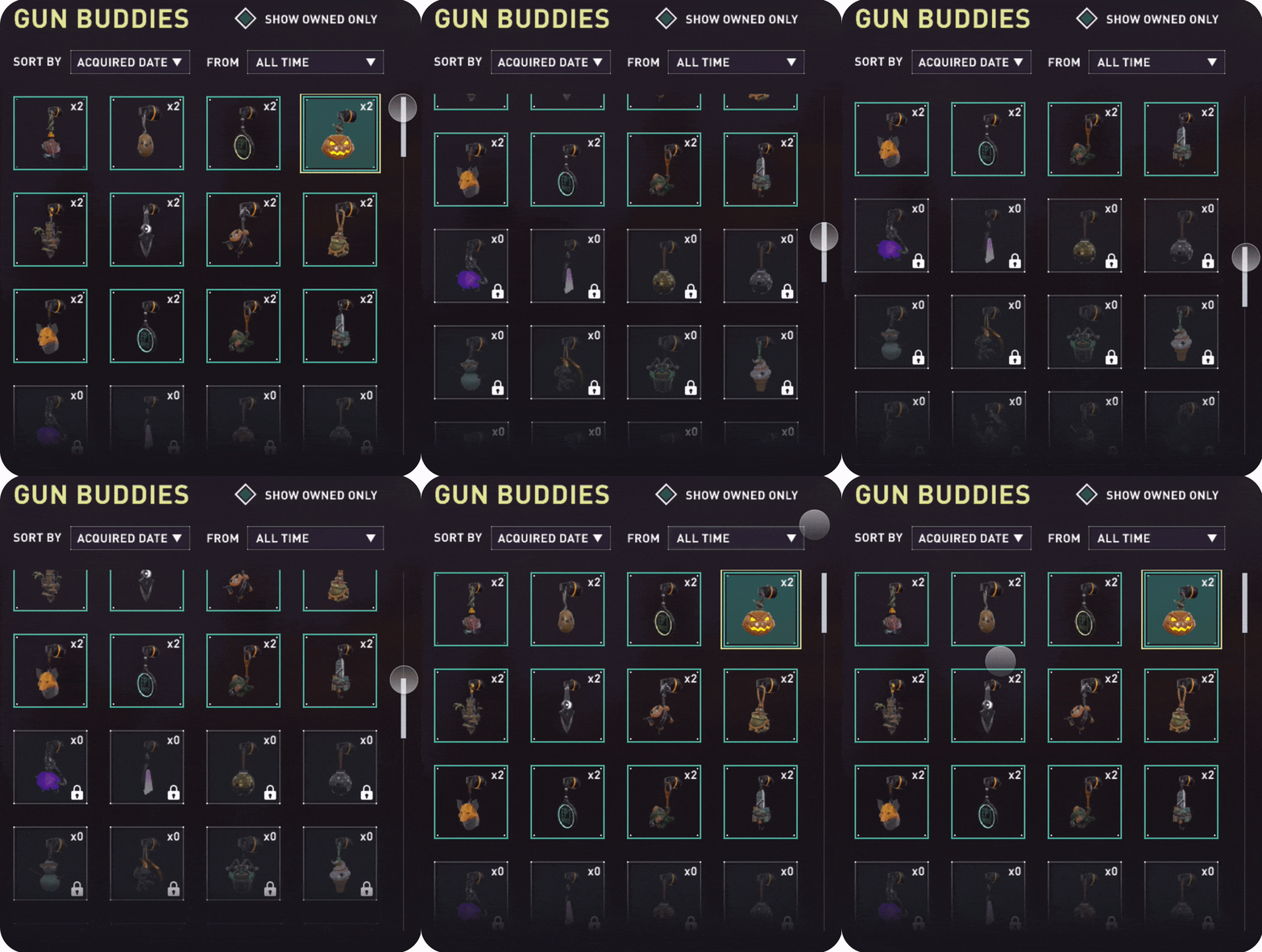
Valorant Gunbuddy Page Redesign
Prototype Animation Demo
Overview
Valorant is a 5v5 Tactical Shooter video game by Riot Games. This is a game with many cosmetic items. Little charms called Gunbuddies can be unlocked and attached to your weapons for personal expression and style.
Skills
User Interface Design
User Experience Design
Prototype Animation
Timeline
October 2020 - November 2020
Context
The page where you select Gunbuddies to attach to your gun is in an unideal state. The current design features a carousel display of the Gunbuddies in a seemingly random order. As more Gunbuddies get added to the game, it’s quickly going to become very inconvenient to find the buddies you want. This calls for a redesign.
Tools
Figma
Protopie
The Problem
I noticed frustrations I had with the Gunbuddy page right away, but I needed to delve deeper to explore the friction other people experienced. Through surveys of peers, game friends, and Redditors, I was able to narrow down common user pain points.
Replacing the Carousel
With the intention to add filters, the carousel format starts to fall apart. Filters such as “Sort by Acquired Date” won’t work with an infinite carousel because there is no way to tell where you are in the carousel; it lacks a scroll position. If there is no start and end, users won’t be able to tell where their first acquired Gunbuddy is.
Some benefits of the carousel format include simplicity and smooth scrolling. This was an adequate solution in the beta and launch of the game, given the small amount of content to browse. However, as more content is added, it becomes much more inconvenient to scroll in a carousel than a grid.
Sketches
I had some fun exploring different ways to display the Gunbuddies in my sketch phase. Some of which included an expanded carousel with filters or even a reversed Gunbuddy page where you select the guns you want to apply your Gunbuddies to. In the end, I decided a list would accomplish my goals of clarity and ease of use the best, so I sketched out roughly how the elements would be spaced out. I also wanted a way to filter content.
Time was spent here thinking about what type of filters I wanted to implement. I was thinking that it would be useful if users could filter by time or the season in which they received the Gunbuddy.
The Solution
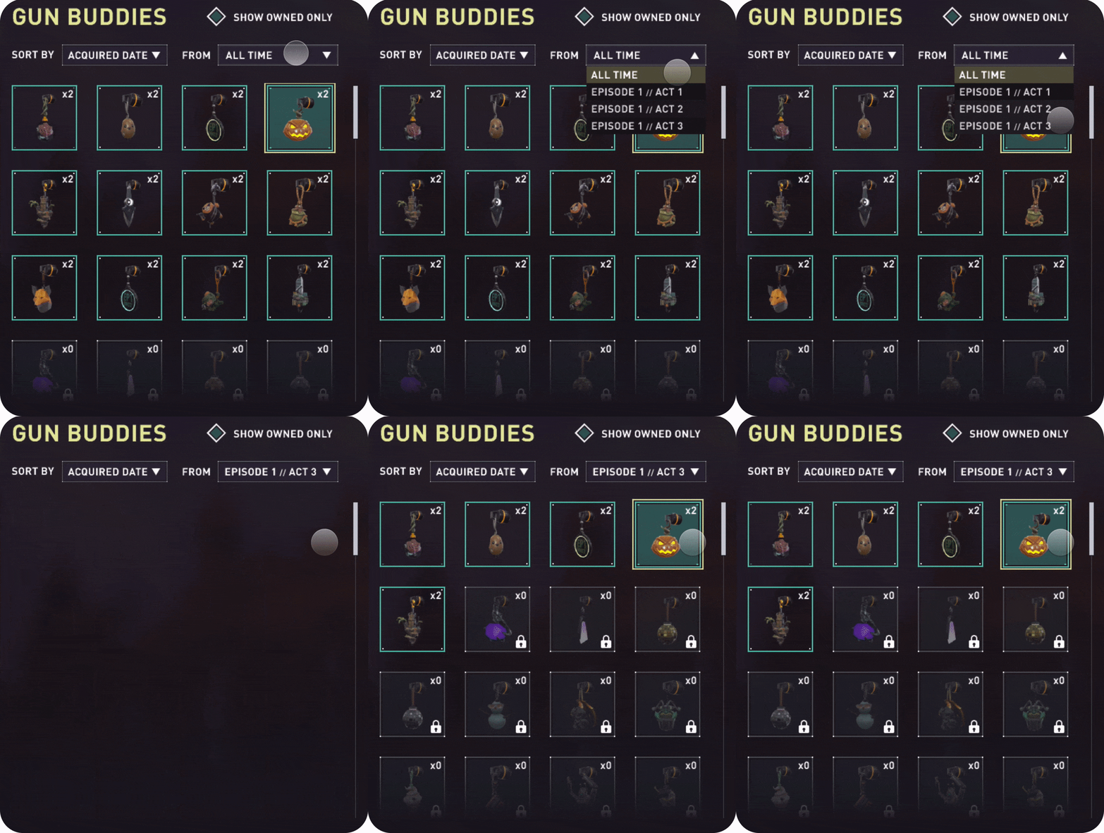
One revision made in the wireframing process was a distinction in filter types. When thinking about how the list would reorder itself when clicking on a filter, I realized time filters such as “Episode 1 // Act 1” (a Season in Valorant) needed to be separated from ordering filters such as “Alphabetical”. I separated these two categories into “Sort By” and “From”.
A gradient fade was also added at the end of the list to allow users to know scrolling is allowed. Initially, I wanted the scroll bar to only appear after someone has scrolled with their mouse wheel or trackpad, but after suggestions from peers, I decided to keep it displayed at all times.
Other Applications
The carousel design is seen in other parts of the game as well, such as the Player Card and Skin pages. The grid system redesign fits pretty nicely into these other cases as well, with some small adjustments needed to be made. This is an example of the player card page quickly wireframed (Left original, Right wireframed).
As a temporary solution, the “Equip Titles” menu, which allows users to add tag lines under their names, is replaced by an edit icon next to a preview of their name and tag.
Protopie Animations
Dropdown Menu
Made by manipulating the height, position, and color of objects on click and hover in/out. The dropdown triangle hints that it’s able to be opened, and it flips to indicate an open position.
Scrollbar
Simple scroll bar interaction made using drag, move, and chain blocks. I wanted a scroll bar interaction in the prototype to get a feel for how users would search.
Cascade Effect
Made using multiple opacity blocks chained together with small delay in between. I wanted a simple animation to convey that the list of Gunbuddies has updated.
Reddit Post
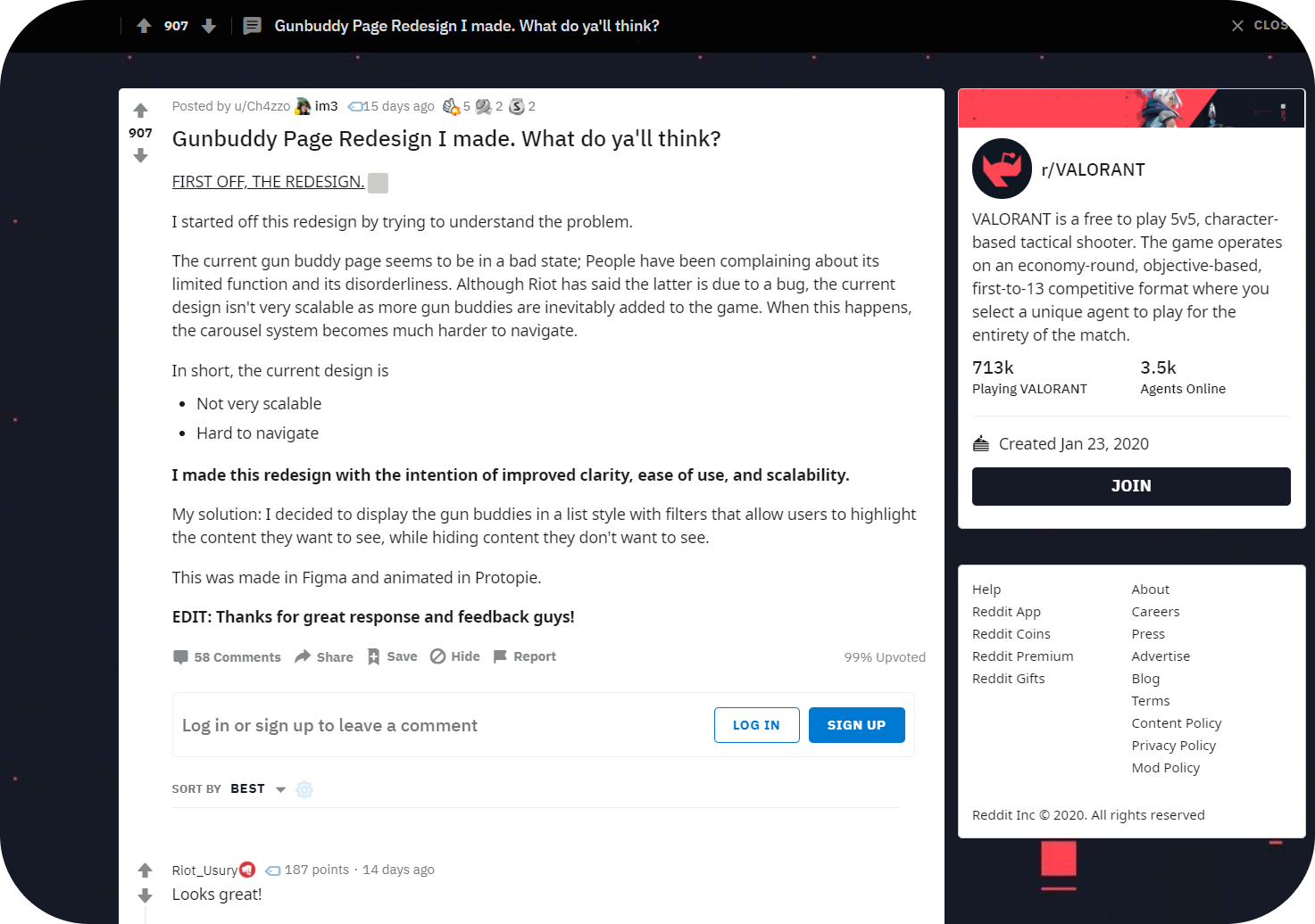
I posted on the VALORANT subreddit about my redesign and got great feedback. Overall the response was positive, and I even got a response from a Riot developer!
Feedback to Note
Favorites Filter
I like this idea to add a Favorites filter to further empower users to find the content they want. This is something pretty easy to implement into my design as well. I quickly mocked up possible ways this could look.


